What a landing page is actually for
A landing page is not a smaller homepage. It has one job: move a visitor toward one specific action. That might be booking a call, signing up, downloading something, or making a purchase.
The more options you give people, the fewer actions they take. Strong landing pages work because they remove everything that does not directly support the goal.
Single page, single CTA
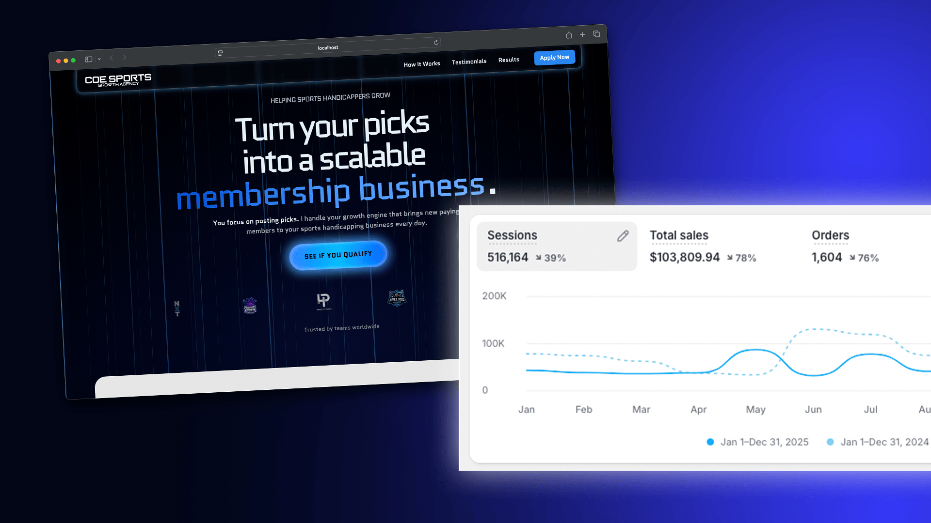
High-converting landing pages follow a strict rule: one page, one offer, one call to action. No navigation, no competing buttons, no side paths.
This creates psychological clarity. Visitors are never asking: “Where should I go next?” They only decide: “Do I want this, or not?”
Start with outcome, not features
People do not care about your process, stack, or tools until they understand what they gain. Your hero section must communicate the outcome immediately.
Use this structure:
What you help someone achieve + who it is for.
Examples:
- Build a profitable online course without technical overwhelm.
- Turn your website into a consistent source of qualified leads.
- Launch your product with a page that actually converts.
Remove friction above the fold
The top of your landing page must answer three questions instantly:
- What is this?
- Who is it for?
- Why should I care?
If any of those are unclear, conversion drops. Clarity always beats cleverness.
Explain the problem before the solution
Strong landing pages make visitors feel understood before trying to sell them. This creates trust and attention.
Describe the pain clearly:
- What is frustrating?
- What feels confusing?
- What has not worked before?
When the problem feels accurate, your solution feels credible.
Present your offer as a transformation
Your product or service is not the hero. The visitor is. You are the guide.
Show the shift:
- From uncertainty → clarity
- From chaos → structure
- From effort → confidence
This makes your offer emotionally legible, not just logically attractive.
Use social proof strategically
Testimonials, results, or usage numbers work best when placed after you describe the offer. They reduce doubt at the exact moment the visitor is considering action.
The goal is not praise. The goal is validation: “Someone like me trusted this and it worked.”
Make the CTA feel safe
People hesitate when they feel risk. Reduce it.
- Explain what happens after they click
- Clarify if it is free, reversible, or low commitment
- Use calm language, not urgency traps
Strong CTAs feel clear and grounded, not aggressive.
Repeat the CTA with context
Your CTA should appear multiple times, but each time it should feel more justified. As clarity increases, resistance drops.
By the final CTA, the visitor should feel: “This makes sense. I know what I’m choosing.”
Design for reading, not decoration
Conversion design is about structure:
- Short paragraphs
- Clear visual hierarchy
- Whitespace that guides attention
- Obvious CTA placement
Visual polish matters, but clarity moves people.
Landing pages are systems, not art pieces
A landing page is a communication system. Every section answers a specific question in the visitor’s mind.
When those questions are answered in the right order, conversion becomes a natural result, not a trick.
Strong landing pages feel calm, honest, and intentional. They do not convince. They clarify.
Want to make better websites?
Check out our growing list of free and paid tools to help you run a better creative business.
Free • No Credit Card Required